Peace-Seeking Palettes for 2019

Can color change the world?
Dutch Boy Paints thinks so. Recently announcing its 2019 Color of the Year, Garden Patch 326-5DB, the brand reports that the soothing shade of green reflects a growing optimism in the U.S., and that its three new eight-color design palettes—Homestead, Studio and Sanctuary—embody a "happier, more empathetic country that seeks greater peace and celebrates diversity."
According to Rachel Skafidas, color and design manager at Dutch Boy Paints,
| All of our colors for 2019 have a happier tone and reflect an upswing in how people are feeling. Even colors that are traditionally on the cooler side of the palette have a level of warmth and happiness that we haven't seen in the recent past. Even though people may see challenges in their lives, they're thinking positively and expressing more empathy. |
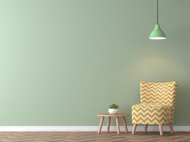
Garden Patch, a green that's not too deep and not too primary, is a botanical hue that stands out for its warm and calming effect. It can be paired well with soft naturals and pops of warm color, making it a good choice for all areas of the home, including as an exterior accent color.
Green takes a starring role throughout Dutch Boy's new palettes:
Natural warmth is central to the Homestead palette, which captures the feeling of simple living and is grounded in soft neutrals and fuchsias, reds and an inspired green. Colors include: Antiqued Fuchsia 246-7DB, Preppy Pink 204-5DB, Fruity Pink 105-2DB, Garden Patch 326-5DB, North Haven 334-4DB, Silenced Blue 339-2DB, Warmed Silver 440-1DB and Antiqued Lace 017W.
Studio is inspired by a culture of inclusiveness and the celebration of our differences. Colors include: Summer Treat 108-6DB, Honeybee Yellow 116-6DB, Mineralized Jade 230-5DB, Wave Runner 135-7DB, Santa Rosa Red 204-7DB, Glitterberry 147-6DB, Baltic Gray 437-1DB and Cooled Graphite 436-6DB.
Sanctuary reflects a new focus on spirituality and the idea of home as both a shelter and a place that nourishes us. The colors for this palette are built in two halves: one with muted, calming pastels and the second with deep, saturated hues that add energy: Plume Purple 341-7DB, Dashing Blue 339-6DB, Crystal Beach 135-2DB, Hidden Garden 330-5DB, Fairy Wing 332-1DB, Lime Flower 124-3DB, Antiqued Parasol 109-2DB and Blue Wood Aster 243-1DB.